Carhartt Packaging
2022
3-D for Graphic Design
Adobe Photoshop
For this project, we were assigned to choose an existing brand, and create new packaging for them. I chose Carhartt.
Touchpoints
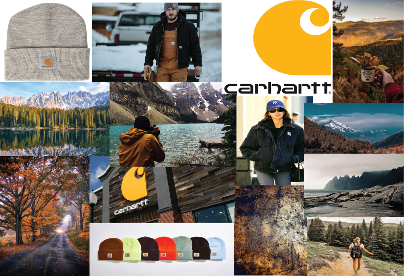
The reason why I chose Carhartt was because I wanted to create packaging that could be used if they had their own stores. They currently do not have any packaging that could be used if people were to buy something in person. The focus for all the touch-points has to deal with nature, since that is what the brand represents.
Gift Bag
Gift Box
Gift Cards
The gift box, I wanted to stick with another scenic theme. I wanted to choose more of a water environment. Brought in a nice contrast of colors, bringing in a baby blue color. And with the logo, keeping it like the bag, almost having it come out of the water.
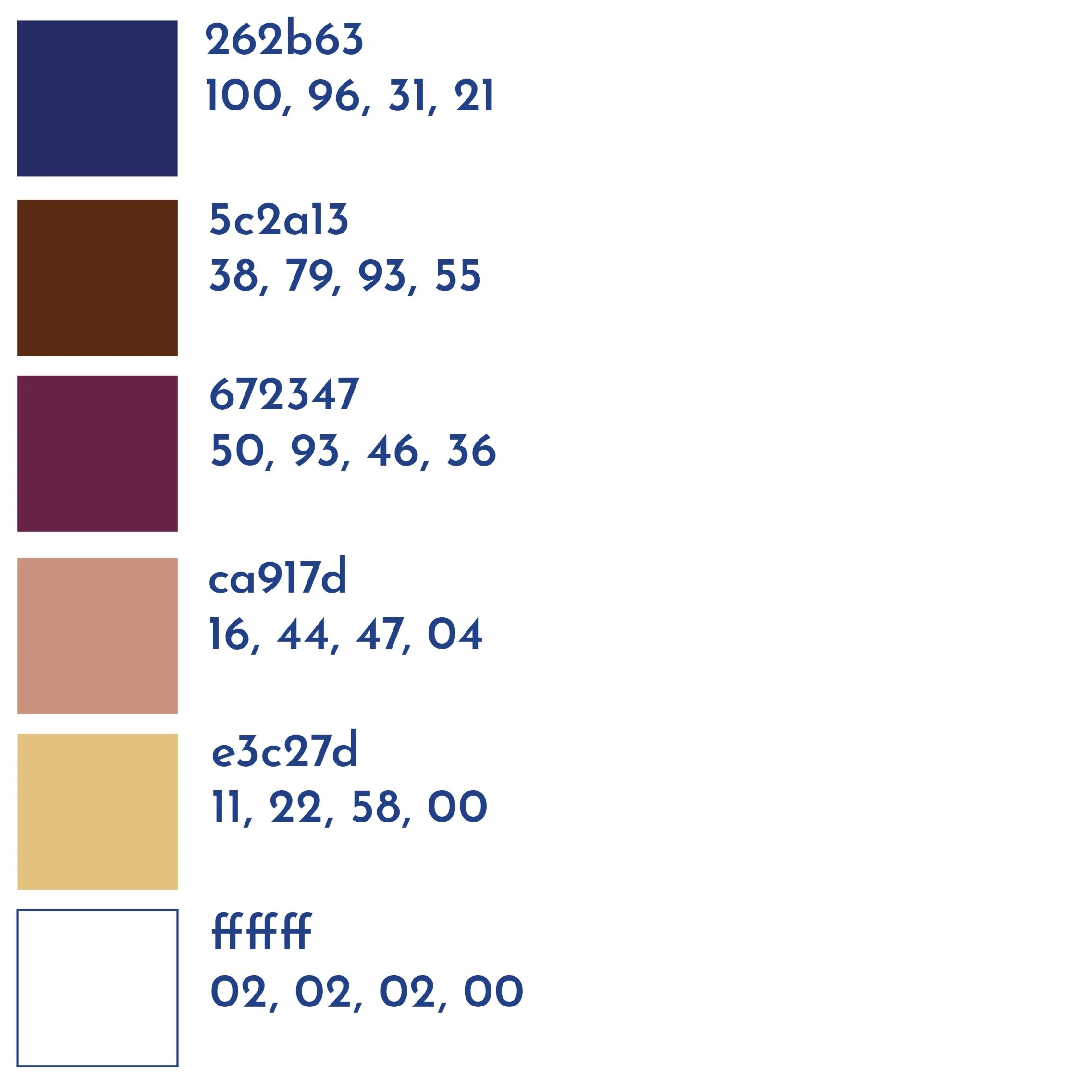
For the gift bag, I wanted to create an effect where it looks like the logo is almost popping out of the mountains. And for the colors, keep it pretty close to the brand’s exact colors. The strings for the bag are made out of shoelaces, since shoes are what Carhartt is mainly known for.
The gift cards, I wanted to keep them more simple and straight-forward. I decided to do different forms of nature and use different colors that go along with the forms of nature.


